

CSS-Only Rounded, Shadowed, Transparent Corners
I've been super frustrated on a web project I've been on where I've wanted CSS-only (no slow-ass JSON solutions) rounded corners with transparent backgrounds and and drop shadows. I originally tried a 3 image solution with transparent backgrounds, but it didn't work well and the middle image showed up behind the top and bottom images. I tried just making the backgrounds of the png's match the css background, and I discovered the OSX Safari png gamma correction bug. I hate GIF's and JPEG's as much as I can avoid them, so I decided to just rewrite the solution from scratch, which isn't that hard.
The real reason I am writing this is because 90% of the time I want to do something online I just search for code to do something and use the first result as a template. It took me like 30 tries and I still found nothing decent, so I decided to just do it myself from scratch, and maybe someone else can use it.
This is a 9 image solution made in 3 horizontal sections: a header, a center block, and a footer. Yea, it's a ton of nested divs, but it validates, uses no overlap, works on all browsershots I have tested, and can be used with very small pngs. First of all, here's a sample of the result. Here's the images, their titles, and their dimensions, all of which can be modified:
- Top Left Corner, 15px x 15px, tlc.png

- Top Border, 1px x 15px, tb.png

- Top Right Corner, 15px x 15px, trc.png

- Left Border, 15px x 1px, l.png

- Center, 1px x 1px, c.png

- Right Border, 15px x 1px, r.png

- Bottom Left Corner, 15px x 15px, blc.png

- Bottom Border, 1px x 15px, bb.png

- Bottom Right Corner, 15px x 15px, brc.png

The html for this box is as follows:
<!DOCTYPE html PUBLIC "-//W3C//DTD XHTML 1.0 Strict//EN" "http://www.w3.org/TR/xhtml1/DTD/xhtml1-strict.dtd">
<html xmlns="http://www.w3.org/1999/xhtml" xml:lang="en" lang="en">
 <head>
  <link rel="stylesheet" href="style.css" type="text/css" media="screen" title="no title" charset="utf-8"/>
 </head>
 <body>
  <div id="box">
   <div id="tlc"><div id="trc"><div id="tb"></div></div></div>
   <div id="lb"><div id="rb"><div id="c">
    <p>Holy Crap, content galore!</p>
   </div></div></div>
   <div id="blc"><div id="brc"><div id="bb"></div></div></div>
  </div>
 </body>
</html>
View the CSS for this technique here. Here's how this all breaks down in the box:
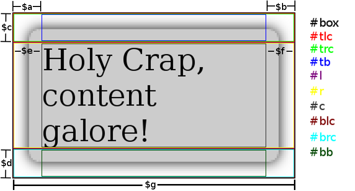
Here's the css required to make this happen, using the variables in the above image:
#box {
  text-align: left;
  position: relative;
  margin: 0 auto;
  padding: 0;
  width: $g;
}
#box #c {
  background: transparent url('c.png') repeat center center;
  margin: 0 $e 0 $f;
}
#box #tlc {
  height: $c;
  background: transparent url('tlc.png') no-repeat top left;
}
#box #trc {
  height: $c;
  background: transparent url('trc.png') no-repeat top right;
}
#box #blc {
  height: $d;
  background: transparent url('blc.png') no-repeat bottom left;
}
#box #brc {
  height: $d;
  background: transparent url('brc.png') no-repeat bottom right;
}
#box #tb {
  height: $c;
  margin: 0 $a 0 $b;
  background: transparent url('tb.png') repeat-x top center;
}
#box #bb {
  height: $d;
  margin: 0 $a 0 $b;
  background: transparent url('bb.png') repeat-x bottom center;
}
#box #rb {
  background: transparent url('r.png') repeat-y center right;
}
#box #lb {
  background: transparent url('l.png') repeat-y center left;
}
p {
  margin: 0 auto;
  padding: 0;
}
It should be very flexible; if you need to you can make the borders bigger or smaller, you can even use different widths for the bottom corners if you must. I thought about toying with another master-div that was on a higher z-index plane so your content could dip into the header/footer, but I decided against it because I don't have time. I hope this is useful, it shouldn't be so complicated but there were no decent guides online.